Best practices landing page: 9 tactics to boost conversions
Discover the best practices landing page that converts, with 9 proven tactics, practical examples, and tips to boost your results.
So you've done the hard work: you've driven traffic to your landing page, but the conversions just aren't happening. It feels like pouring water into a leaky bucket, and frankly, it's frustrating. The problem isn't your product or your offer; it's that most landing pages are built on outdated advice. They’re static, predictable, and fail to engage. They talk at visitors instead of with them.
This isn't just a missed opportunity; it's a silent killer of your marketing ROI. As someone who has built and obsessed over interactive funnels, I've seen firsthand how a few strategic shifts can transform a failing page into a lead-generation machine. This guide is your playbook to fix the leaks. We will dive into 9 battle-tested best practices for a landing page that doesn't just look good, but actually converts.
We'll skip the generic fluff and focus on actionable tactics that truly move the needle. You'll see how to structure your page for maximum impact, from the value proposition to the final click. You’ll also see why a simple interactive tool can generate more qualified leads than any static PDF you've ever created, turning passive visitors into active participants.
1. Clear and Compelling Value Proposition Above the Fold
Your value proposition is the first, and most crucial, handshake with a potential customer. It must instantly answer their unspoken question: "What's in it for me, and why should I care?" This core message needs to be displayed prominently above the fold, the area of the page visible without scrolling. If visitors can't immediately grasp the value you offer, they will simply leave. This isn't just theory; it's one of the most fundamental best practices landing page principles championed by conversion experts.

A powerful value proposition is not a slogan or a feature list. It’s a concise statement of the tangible results a customer will get from your solution. Think of Shopify’s classic "Start selling online today"—it’s direct, action-oriented, and promises an immediate outcome. Or Dropbox's "Keep life organised and work moving—all in one place," which clearly states the utility and benefit. They solve a problem, instantly.
How to Implement This
To craft a compelling value proposition, you need to step outside your own perspective and speak your customer's language.
- Focus on Outcomes: Don't describe what your software does; describe what your customer can achieve. Shift from "Our platform integrates data" to "Unify your marketing data for a single customer view."
- Use Customer Language: Dig into sales calls, support tickets, and customer interviews. Pull out the exact phrases your happiest customers use to describe your product’s value. This ensures your message resonates authentically.
- A/B Test Relentlessly: Your first attempt is rarely your best. Create several variations of your headline and sub-headline and test them to see which one performs best. Small changes in wording can lead to significant lifts in conversion rates.
2. Single, Focused Call-to-Action (CTA)
Here's a controversial take: your navigation menu is killing your conversions. A landing page should have one job and one job only. Every element, from the headline to the footer, must guide the visitor toward a single conversion goal. This is achieved through a singular, focused call-to-action (CTA). Unlike a homepage that offers multiple paths (About Us, Blog, Contact), an effective landing page ruthlessly eliminates distractions like site navigation and competing links. This principle is a cornerstone of best practices landing page design because it prevents decision fatigue and creates a frictionless path to conversion.
This focused approach creates a powerful, persuasive funnel. Think of Spotify’s "Get Spotify Free" or HubSpot’s dedicated landing pages for their free tools—each with one clear button to access the offer. The goal is to make the desired action the most obvious and easiest next step for the visitor. By removing all other options, you channel all the momentum you’ve built with your copy and visuals into that one critical click. This is a key part of any effective marketing funnel. Find out more about how this integrates into your broader strategy by reading about building a marketing funnel on interactiveleadgen.com.
How to Implement This
Designing a CTA that converts goes beyond just making a button. It requires a deliberate combination of visual hierarchy, persuasive copy, and strategic placement.
- Use High-Contrast Colours: Your button should visually pop off the page. Choose a colour that stands out from the background and surrounding elements while still aligning with your brand's organised colour palette.
- Write Action-Oriented, First-Person Copy: Shift from generic commands to benefit-driven invitations. Testing "Start my free trial" instead of "Start your free trial" can create a sense of ownership and often boosts click-through rates.
- Ensure Mobile Accessibility: In a mobile-first world, your CTA must be easy to tap. Adhere to a minimum button size of 44x44 pixels to avoid user frustration and ensure a seamless experience on any device.
- Leverage White Space: Don't crowd your CTA. Generous use of white space around the button draws the eye towards it, making it an unmissable focal point on the page.
3. Social Proof and Trust Signals
When a potential customer lands on your page, they are inherently sceptical. Your claims are just claims until someone else backs them up. This is where social proof comes in; it’s the powerful psychological principle that people conform to the actions of others under the assumption that those actions are reflective of the correct behaviour. For a landing page, this means providing evidence that other people, preferably people like your visitor, trust and value your offer. This is one of the most critical best practices landing page elements because it directly addresses the visitor's primary concern: "Can I trust you?"
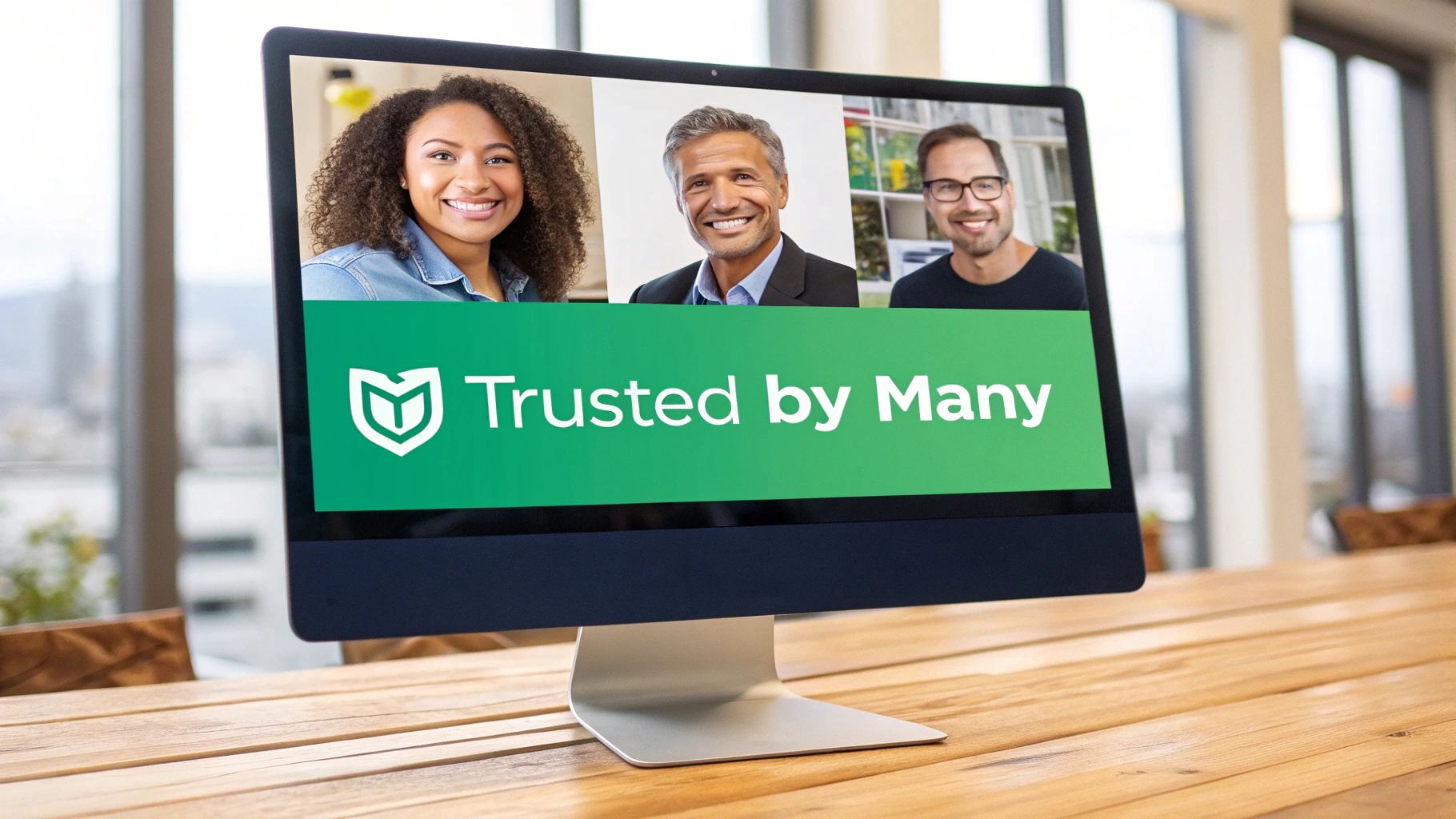
Trust signals take many forms, from client logos and case studies to user statistics and media mentions. Think of Salesforce displaying the logos of major clients like T-Mobile and Unilever, or Shopify’s simple but powerful banner stating it’s "Trusted by millions of businesses". These elements reduce perceived risk and build the credibility needed to encourage a conversion. They shift the conversation from what you say about your product to what the market says.
How to Implement This
Effectively integrating social proof requires more than just dropping a generic quote onto your page. It needs to be authentic, specific, and strategically placed.
- Prioritise Specificity: Vague praise like "Great service!" is useless. Instead, use testimonials that highlight concrete results. A quote like, "We increased our qualified leads by 40% in Q2 using this platform," is far more compelling.
- Show, Don't Just Tell: Include the person's full name, role, and company alongside their photo. This makes the testimonial feel real and relatable. For B2B, logos of well-known clients are instant credibility boosters.
- Place It Strategically: Position your strongest social proof, like a powerful testimonial or an impressive customer count, near your primary Call-to-Action (CTA). This reinforces the visitor's decision at the exact moment they are considering taking action.
4. Mobile-First Responsive Design
Designing for mobile first isn't just a trend; it's a fundamental shift in how we approach web creation. With over 60% of global web traffic originating from mobile devices, a landing page that isn't optimised for smaller screens is actively turning away the majority of potential leads. A mobile-first approach forces you to prioritise what truly matters for conversion.
This strategy involves designing for the smallest screen first and then progressively enhancing the experience for larger screens. It ensures your core message, call-to-action, and user path are crystal clear and frictionless, which is essential for any modern set of best practices landing page guidelines. Think of Stripe’s landing pages; they load instantly and are flawlessly navigable on any device, ensuring their value proposition is never compromised by a poor user experience.
How to Implement This
Adopting a mobile-first mindset means focusing on speed, clarity, and ease of interaction from the very beginning.
- Prioritise Ruthlessly: Mobile's limited screen real estate forces you to cut the fluff. Focus on the single most important action you want a user to take and build the experience around that goal.
- Simplify Forms and Interactions: For mobile users, less is more. Reduce the number of form fields, use large, easily tappable buttons with plenty of space around them, and implement sticky CTAs that stay visible as the user scrolls.
- Test on Real Devices: Browser simulators are useful, but they don't replicate the real-world experience of touch interactions and network latency. Always test your landing pages on actual smartphones to identify and fix usability issues.
- Optimise for Speed: Mobile users are impatient. Compress images, leverage browser caching, and use tools like Google's Mobile-Friendly Test to ensure your page loads quickly, even on slower connections.
5. Strategic Use of Visual Hierarchy
Visual hierarchy is the intentional arrangement of design elements to guide a visitor's eye through your page in a specific order. It’s the invisible hand that leads them from your headline to your value proposition and, ultimately, to your call-to-action. By using size, colour, contrast, and spacing, you control the narrative, making it effortless for users to process information. This principle is one of the most critical best practices landing page fundamentals for reducing cognitive load and boosting comprehension.

When hierarchy is missing, a page feels chaotic, and visitors don't know where to look first. In contrast, companies like Apple and Asana master this by using generous white space and a clear content flow, ensuring the most important message always stands out. This isn't just about looking good; it's about making your page intuitive and directing attention towards the conversion goal.
100% Free Lead Magnet Audit
Our AI analyzes your website and delivers custom growth strategies in seconds.
How to Implement This
Implementing a strong visual hierarchy involves more than just making your CTA button a bright colour. It's about creating a clear path for the user.
- Apply the "Squint Test": Take a step back from your screen and squint your eyes until the text blurs. The elements that still stand out are at the top of your visual hierarchy. Does your primary headline and CTA pop? If not, adjust their size, colour, or contrast.
- Use Colour Strategically: Don't splash colour everywhere. Use a limited palette and reserve your most vibrant, high-contrast accent colour exclusively for your CTA buttons and other critical interactive elements. This trains the user’s eye to associate that colour with action.
- Leverage Size and Space: The largest elements on the page will command the most attention, so make your headline the most prominent text. Use ample white space (negative space) around key elements like forms and buttons to give them breathing room and draw focus.
6. Optimised Form Design and Lead Capture
Your form is the final gateway between a curious visitor and a qualified lead; it's where the conversion happens. Yet, it's often the place where the most friction occurs, causing potential customers to abandon the page. Every field you ask them to fill out increases the cognitive load and the risk of them leaving. Optimising this element is one of the most impactful best practices landing page strategies for immediately boosting conversions. This centres on making the act of providing information as effortless as possible.
Effective form design isn't just about aesthetics; it's about psychology and usability. It means balancing your need for data with the user's desire for a quick, painless experience. Instead of a boring static form, consider how an interactive experience could capture the same data. Think of Typeform's conversational, one-question-at-a-time approach, which feels more like a friendly chat than a bureaucratic process. Even a simple multi-step quiz is more engaging than a long list of fields.
How to Implement This
To transform your form from a conversion killer into a conversion engine, focus on removing every possible point of friction.
- Minimise Fields Ruthlessly: Start with the absolute minimum number of fields required. For a top-of-funnel offer, name and business email are often enough. You can always gather more information later in the customer journey.
- Use Multi-Step Forms for Complexity: If you absolutely need more than 4-5 fields, break the form into multiple, smaller steps. This reduces the initial perceived effort and uses the psychological principle of commitment, as users who start are more likely to finish.
- Provide Instant Feedback: Use inline validation to tell users immediately if their input is correct or incorrect, rather than making them wait until they hit 'submit'. This small detail prevents immense frustration and improves completion rates.
- Leverage Smart Defaults and Social Logins: Pre-fill known information for returning visitors and offer social login options (like Google or LinkedIn) to allow users to sign up with a single click, dramatically reducing friction. This is a core component of a modern lead generation system.
7. Page Speed and Performance Optimisation
In an age of instant gratification, your landing page's load time is not a technical detail; it's a core feature of the user experience. Page speed refers to how quickly your content loads and becomes interactive. A delay of a single second can cause a significant drop in conversions and a spike in bounce rates, as visitors simply won't wait. Prioritising performance is one of the most impactful best practices landing page principles.
The data is undeniable. Case studies from retail giants like Walmart revealed that a one-second improvement in load time increased conversions by 2%. Similarly, Amazon found that a mere 100-millisecond reduction in latency boosted revenue by 1%. For marketers, the lesson is clear: speed directly translates into leads and revenue. A slow page communicates inefficiency and a poor user experience before a visitor has even read your headline.
How to Implement This
Optimising your page speed involves a series of technical adjustments that deliver a faster, smoother experience for your visitors.
- Compress and Optimise Images: Large images are often the biggest culprits. Use tools like TinyPNG to compress images to under 100KB without sacrificing quality. Also, implement lazy loading so images below the fold only load as the user scrolls down to them.
- Minimise and Defer Code: Use tools to minify your CSS, JavaScript, and HTML files, removing unnecessary characters and reducing file size. Defer the loading of non-critical JavaScript and CSS to eliminate render-blocking resources that slow down the initial view.
- Leverage Caching and a CDN: Use browser caching to store parts of your page on a visitor's device, so it loads much faster on subsequent visits. A Content Delivery Network (CDN) like Cloudflare stores copies of your page on servers worldwide, delivering it from the location closest to the user for maximum speed.
- Conduct Regular Audits: Use Google PageSpeed Insights to diagnose performance issues and receive specific recommendations for improvement. Make speed a regular part of your maintenance routine, not a one-time fix.
8. Benefit-Focused Copywriting
Your visitors don't care about your product's features; they care about what those features can do for them. Benefit-focused copywriting shifts the narrative from "what it is" to "what's in it for me," answering the customer's most pressing question before they even have to ask. This is a cornerstone of any high-performing landing page because it connects your solution directly to the visitor's pain points and desired outcomes.
This is one of the most critical best practices landing page strategies because it transforms abstract functionalities into tangible results. Instead of saying your software has "AI-powered analytics," you say it helps customers "Uncover hidden revenue opportunities in minutes." Slack's homepage doesn't list chat features; it promises "Move faster with your tools in one place." It’s about selling the destination, not the vehicle.
How to Implement This
To master benefit-focused copy, you need to deeply understand your customer's world and translate your product's capabilities into their language.
- Use the "So What?" Test: For every feature you list, ask "So what?" and keep answering until you arrive at a core human benefit like saving time, reducing stress, or increasing revenue. "Our tool integrates with Salesforce" becomes "so you can update your CRM without leaving the platform," which means "saving you 10 hours of manual data entry every month."
- Write for "You," Not "We": Scour your copy for sentences that start with "We offer" or "Our product has." Rephrase them to focus on the customer. Change "We provide detailed reports" to "You get the insights you need to make smarter decisions."
- Leverage the PAS Formula: Structure your copy using the Problem, Agitate, Solution (PAS) framework. First, state the problem your visitor is facing. Next, agitate it by describing the frustrations it causes. Finally, present your solution as the clear, obvious answer. This creates a compelling narrative that guides the visitor toward conversion.
9. Strategic A/B Testing and Continuous Optimisation
Even the most well-designed landing page is built on assumptions. Strategic A/B testing, also known as split testing, is the process of dismantling those assumptions with data. It involves comparing two versions of a page element to see which one performs better, allowing you to make incremental improvements that compound over time. This commitment to continuous optimisation is a core tenet of modern conversion rate optimisation and one of the most vital best practices landing page strategies to adopt.
Guesswork leads to wasted ad spend and missed opportunities. Data-driven testing provides definitive proof of what resonates with your specific audience. The 2008 Obama campaign famously used A/B testing to increase sign-up rates by 40%, generating an additional $60 million in donations. Similarly, a well-known SaaS company discovered that changing a button's text from "See Plans" to "See Our Plans" boosted conversions by 30%, a small change with a significant impact.
How to Implement This
Effective A/B testing is a disciplined, scientific process, not a series of random tweaks. It requires a systematic approach to produce reliable results.
- Prioritise Your Tests: Start with high-impact elements like your headline, value proposition, and primary call-to-action (CTA). Use a framework like PIE (Potential, Importance, Ease) to score and rank test ideas, ensuring you focus your efforts where they matter most.
- Isolate Variables: Test only one element at a time. If you change the headline and the CTA button colour simultaneously, you'll never know which change was responsible for the lift or drop in conversions. Isolate the variable to get clean, actionable data.
- Run Tests to Significance: Don't end a test prematurely just because one version appears to be winning. Run your experiment until you reach a minimum of 95% statistical confidence to ensure the results aren't due to random chance. This data-backed approach is crucial for building a high-performing marketing funnel, a key component of any effective lead management software strategy which you can find out more about in our in-depth guide on lead management software.
Stop Building Pages. Start Building Experiences.
We have explored the essential building blocks of a high-performing landing page, from crafting a magnetic value proposition to the meticulous science of A/B testing. Following these nine best practices for a landing page will undoubtedly lift your conversion rates, sharpen your lead quality, and deliver a better return on your marketing spend. You now have a comprehensive blueprint to analyse, diagnose, and optimise every critical element of your conversion funnels.
However, the true masters of lead generation understand that a landing page is not the final destination. It is the beginning of a conversation. The real opportunity lies in shifting your mindset from building static, one-way information dumps to creating dynamic, two-way value exchanges.
The Shift from Passive to Interactive
Your prospects are drowning in a sea of generic white papers, static case studies, and predictable webinar sign-ups. While the principles we’ve covered are crucial for presenting these assets effectively, the assets themselves are often the weak link. The future of conversion isn't just about optimising the page; it's about revolutionising the offer itself.
- Instead of a PDF guide, offer an interactive assessment that diagnoses a user's specific business challenges and provides a personalised report.
- Instead of a case study, build a simple ROI calculator that allows a prospect to input their own figures and see the potential financial impact of your solution.
- Instead of a generic demo request, create a configurator or solution builder that lets them design their ideal setup and pre-qualifies their intent.
These interactive experiences do something a static lead magnet cannot: they provide immediate, tangible value. They engage a user's intellect, answer their specific questions, and transform a passive visitor into an active participant. If you're unsure how your current lead magnet stacks up, running it through a free tool like the Magnethive lead magnet audit can give you a comprehensive report and even generate AI-powered ideas for more interactive alternatives. This approach doesn't just capture a lead; it creates a memorable, helpful interaction that positions your brand as a resourceful partner from the very first click. It's the ultimate embodiment of showing, not just telling.
Your Actionable Next Steps
Mastering the best practices for a landing page is your foundational step. Now, it's time to build upon that foundation. Start small. Identify your most downloaded (yet least engaging) PDF and brainstorm how you could transform its core insights into a simple quiz or calculator. The tools to build these are more accessible than ever, requiring no deep technical expertise.
By combining a perfectly optimised page structure with a genuinely valuable, interactive offer, you stop merely collecting contacts. You start building a pipeline filled with educated, engaged, and highly qualified prospects who have already experienced the value you provide. That is how you win in today's crowded digital landscape.