Countdown for Black Friday: A High-Converting Urgency Toolkit
Build a high-impact countdown for Black Friday with this guide. Learn UX patterns, technical tips, and lead generation strategies that drive sales.
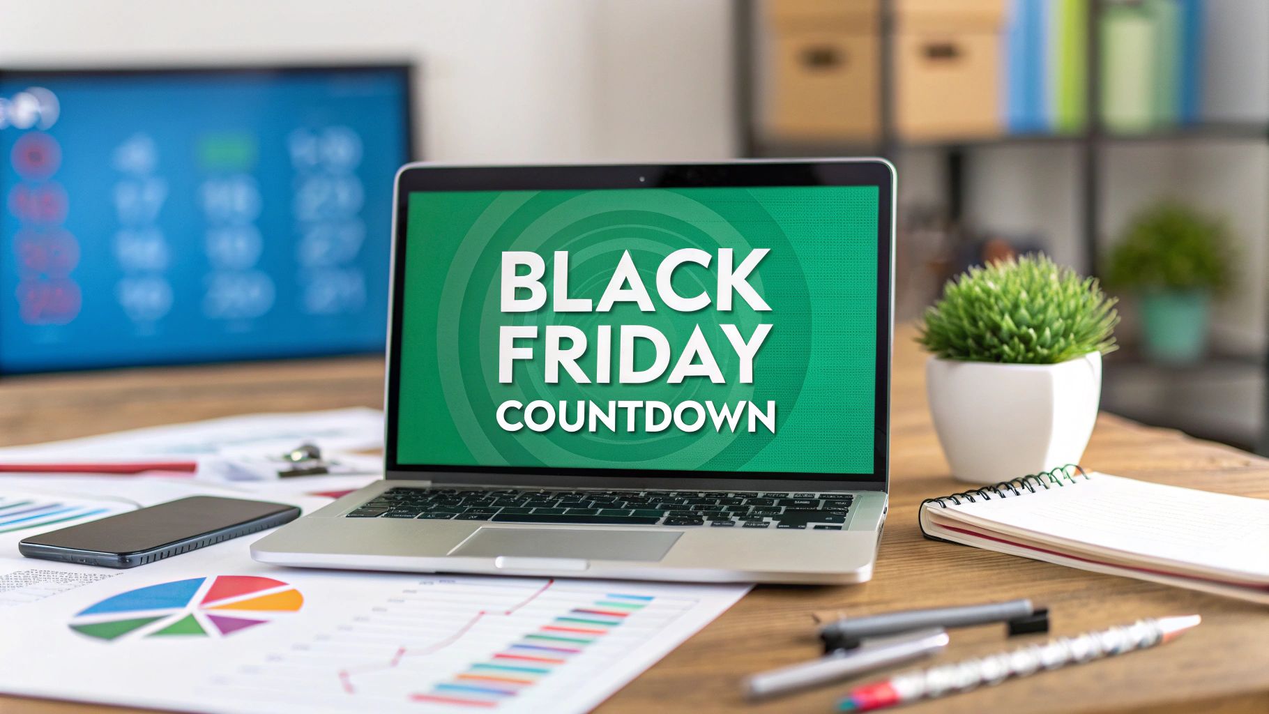
A well-built countdown for Black Friday is way more than just a ticking clock. Think of it as the visual heartbeat of your entire campaign—a simple tool that taps into some powerful psychological triggers to create real anticipation and drive people to act. It’s what turns passive window shopping into an urgent, can't-miss event.
Why a Countdown Is Your Black Friday Secret Weapon
That ticking clock does more than just show the time until your sale starts; it creates a sense of urgency. By creating a limited window of opportunity, a countdown timer instantly frames your Black Friday deals as a scarce resource, which, of course, makes them far more desirable.
It's a simple visual cue, but it becomes the anchor for your whole promotional strategy.

This whole strategy works because it leans on powerful emotional drivers that we all have. Two of the big ones are:
- Fear of Missing Out (FOMO): When customers see that time is running out, they feel a real pull to act before the opportunity vanishes for good. It's a classic for a reason. For example, a limited-time "early bird" discount that expires when the timer hits zero pushes on-the-fence shoppers to commit.
- Loss Aversion: Psychologically, people are more motivated by the fear of losing something than by the idea of gaining something of equal value. The countdown constantly reminds them of the potential "loss" of a killer deal.
Put these two together, and a standard promotion transforms into a genuinely exciting, time-sensitive event that grabs attention across your website, emails, and social channels.
Given the intense competition during this period, standing out is crucial. A countdown timer is a proven way to capture and hold audience attention.
Turning Urgency Into a Lead Generation Engine
Beyond just pushing for immediate sales, a countdown is a fantastic asset for building a high-intent audience before your sale even kicks off. Pair that timer with a strong call-to-action, and you can turn all that built-up anticipation into a solid list of qualified leads.
A countdown doesn't just tell time; it builds an audience. By offering early access or exclusive deal alerts in exchange for an email, you're not just creating urgency—you're curating a list of your most eager customers, ready to buy the moment your sale goes live.
This is a core concept in modern marketing. You can learn more about how to engage customers through these kinds of dynamic elements in our detailed guide to interactive marketing.
Strategic Benefits Across Your Campaign
Adding a countdown timer isn't just a gimmick; it provides some serious strategic advantages that support your key marketing goals. It’s a tool that can amplify your entire campaign, from building initial awareness right through to the final conversion.
Here's a quick look at how a simple countdown can strategically benefit your entire campaign.
Countdown Timer Impact on Key Marketing Goals
| Marketing Goal | How a Countdown Timer Contributes |
|---|---|
| Increase Urgency & Conversions | Directly leverages FOMO and loss aversion to encourage immediate purchases once the sale starts. |
| Boost Lead Generation | Captures emails by offering "early access" or "deal notifications" to a highly motivated audience. |
| Enhance Campaign Awareness | Creates a shareable and memorable visual anchor for social media, ads, and email marketing. |
| Drive Repeat Traffic | Gives users a reason to return to your site to check the time remaining, increasing engagement pre-launch. |
| Improve Message Consistency | Provides a single, unified visual element that ties all your promotional channels together seamlessly. |
As you can see, the benefits go far beyond just showing a ticking clock.
Ultimately, a countdown reframes your sale from a simple discount into a shared, anticipated experience. It gives customers a clear, compelling reason to act now and a simple way to make sure they don't miss out, making it an essential tool for maximising your Black Friday revenue.
Designing a Countdown That Converts
A countdown’s design has a massive impact on its power to persuade. Seriously.
Moving beyond generic templates is the first step. The difference between a timer that gets ignored and one that actually drives sales often comes down to proven user experience (UX) patterns. Every visual choice—from where you place it to the colours and fonts you use—needs to work together to scream "urgency" without messing up the user's journey.
The first big decision you need to make is placement. Where you stick your countdown timer dictates how much attention it gets and the psychological punch it packs.
Strategic Countdown Placement
There are two primary strategies that work exceptionally well for a countdown for Black Friday, each serving a different goal.
- The Hero Banner Timer: This is your go-to for maximum impact. Place a big, dynamic countdown right in the hero section of your homepage or a dedicated landing page. You literally can't miss it. This approach is perfect when you first launch your Black Friday campaign because it immediately tells everyone something huge is about to drop. For a practical example, think of how major electronics retailers often replace their entire homepage hero image with a massive timer ticking down to their doorbuster deals.
- The Sticky Navigation Bar Timer: For a more persistent, subtle sense of urgency, nothing beats a smaller timer in a sticky header or footer. As people scroll down your site, the countdown stays in view, constantly reminding them of the deadline without being annoying. This tactic is gold in the final days and hours leading up to the sale.
And don't think a countdown has to be boring. Look at how a creative timer can be woven right into a site's design to build genuine anticipation.
This example proves a countdown can be both artistic and functional. It becomes a core part of the brand's story, not just some widget you tacked on at the last minute.
Visual Design That Drives Action
Once you've nailed down the placement, it's time to get into the visual details. Every single element should be deliberate and laser-focused on getting that conversion.
Remember, the whole point of this timer is to turn visitors into customers. It's always a good idea to brush up on proven strategies to increase e-commerce conversion rates, as those core principles absolutely apply here.
Colour Psychology and Branding
Choosing colours is a balancing act. You need to respect your brand identity but also tap into the established psychology of urgency.
- High-Contrast Urgency: Reds, oranges, and yellows are the universal signals for "pay attention now!" They grab the eye instantly and are fantastic choices for CTA buttons or the timer digits themselves.
- Brand-Aligned Aesthetics: Your countdown shouldn't look like it crash-landed on your site from another planet. Use your brand’s primary or secondary colours for the timer’s background or surrounding elements. This ensures it feels integrated and professional, not like a cheap, tacky plugin. A solid approach is to use brand colours for the container and a high-contrast accent colour for the numbers.
Typography and Readability
This is non-negotiable: the text must be instantly readable on every device, from a giant desktop monitor to a tiny mobile screen.
Your countdown has one job: to be clearly understood in a single glance. Prioritise readability over artsy fonts. If a user has to squint to read the time left, you've already lost their attention and killed the urgency.
Pick a bold, clear, sans-serif font for the numbers. Make sure there’s plenty of contrast between the text and its background. This is a fundamental we cover in our guide on landing page best practices—clarity always wins against cleverness.
Common Design Mistakes to Avoid
A great countdown design enhances the experience. A bad one just gets in the way. Steer clear of these classic blunders:
- Obstructing Key Information: Whatever you do, don't place your timer over crucial navigation links, product images, or your main call-to-action. It's there to complement your content, not cover it up.
- Creating Visual Clutter: The countdown should be a clean, simple element. Piling on weird animations, sounds, or clashing graphics just makes the page feel chaotic and untrustworthy. Keep it simple.
- Ignoring Mobile Users: That massive hero timer that looks epic on your desktop? It can completely hijack a mobile screen. Always, always design and test your countdown on mobile first. Make sure it scales properly and doesn't destroy the user experience on smaller devices.
By focusing on smart placement, intentional visual design, and a user-first mindset, your countdown stops being just a clock and becomes a seriously powerful conversion tool.
Choosing Your Countdown Implementation Method
Getting your countdown for Black Friday live doesn't have to be a massive technical headache. The right way forward really just depends on your team's comfort with code, what platform your website runs on, and where you need the timer to actually show up. The good news is, there's a path for pretty much every scenario, from simple copy-paste jobs to slick plugins and even some clever hacks for tricky spots like email.
We will walk through the most common ways to get this done so you can pick the best fit for your campaign. We'll cover everything from pure JavaScript for total control, to user-friendly plugins for WordPress and Shopify, and even creative solutions for email and AMP pages where traditional scripts won't fly.
This decision tree can help you visualise which placement strategy makes the most sense for your main goal, whether that's cranking up the urgency or just building general awareness for the upcoming sale.
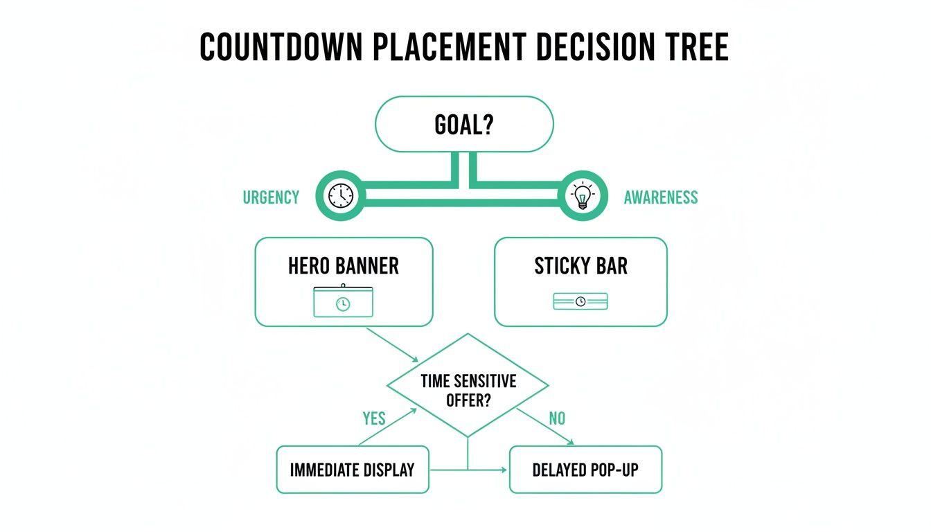
The key takeaway here is to match the timer's visibility to its job. A big, bold timer in your hero banner screams high-stakes urgency, while a sticky bar at the top of the page serves as a constant, subtle reminder.
The JavaScript Snippet Approach
For anyone who wants maximum control and zero bloat, a self-contained JavaScript snippet is the cleanest route. This just means adding a small block of code directly into your site's HTML, either by hand or through a tag manager. The big advantage? It doesn't rely on any third-party plugins, which means faster load times and fewer dependencies that could break.
This path is perfect for custom-built websites or for marketers who are comfortable with basic HTML and JavaScript. You can find tons of production-ready snippets online that you can just copy, paste, and tweak with your sale's end date.
Here’s a rough idea of how it works:
- Find a Script: A quick search for a "vanilla JavaScript countdown timer script" will give you plenty of options.
- Set the Target Date: Open the script file and find the line where the end date is defined. Change it to your Black Friday sale's start or end time.
- Place the HTML: Add a
<div>element with a unique ID (like<div id="countdown-timer"></div>) right where you want the timer to appear on your page. - Embed the Script: Paste the JavaScript code just before the closing
</body>tag in your HTML.
That’s it. You'll have a functional timer that your designers can then style with CSS to make it look completely on-brand.
Using CMS Plugins and Apps
If you'd rather not touch code, or you're on a platform like Shopify, WordPress, or Webflow, then plugins and apps are your best friend. These tools give you a simple interface where you can design and launch a countdown timer in minutes, no coding required.
They often pack in extra features that would be a pain to build from scratch, like:
- Pre-designed Templates: Launch a professional-looking timer that doesn't clash with your site's design.
- Geotargeting: Show timers that count down based on a user's local timezone.
- Post-Expiry Actions: Automatically redirect visitors or reveal a discount code the moment the timer hits zero.
For WordPress folks, popular page builders often have this feature baked right in. If you're a Divi user, this guide on how to create a countdown popup in Divi walks you through the whole setup, showing you how to blend urgency with lead capture. Over on Shopify, the App Store is loaded with options like "Countdown Timer Bar" that can add a sticky banner to your store in just a few clicks.
Pro Tip: While plugins are super convenient, they can add extra code that slows your site down. Always pick well-reviewed, lightweight plugins and run a page speed test before and after you install one. A slow site kills conversions, so don't skip this step.
100% Free Lead Magnet Audit
Our AI analyzes your website and delivers custom growth strategies in seconds.
Creative Workarounds for Email and AMP
But what about places where JavaScript is a no-go, like in most email clients or on AMP (Accelerated Mobile Pages)? This is where you have to get a little creative. A live, ticking timer is off the table, but you can create a pretty powerful illusion of one.
The go-to method is a dynamically generated animated GIF. Several online services can cook up a GIF that simulates a real-time countdown. Each time a user opens their email, the server generates a fresh GIF showing the current time remaining.
You just embed this GIF into your email template like any other image. It might not be accurate down to the exact second for everyone, but it delivers the exact same visual punch and sense of urgency. It's a surprisingly effective trick for driving clicks, especially in those final, frantic hours of your promotion.
Connecting Your Countdown to Lead Generation
A ticking clock creates powerful urgency. We all know that.
But its real value isn't just in announcing a sale—it's in pairing that anticipation with a direct way to connect with potential customers. Your countdown for Black Friday shouldn't just be a passive announcement. Its primary job is to actively build your email list with high-intent subscribers before the shopping frenzy even starts.
You’re essentially turning passive window shoppers into an engaged audience you can talk to directly. That’s the whole game.
To do this, your countdown needs a crystal-clear call-to-action (CTA) sitting right next to the timer. This is the bridge that takes a visitor from "Oh, that's interesting" to becoming a tangible lead.
Forget generic CTAs like "Sign Up." Use language that screams value and exclusivity. You need to frame the sign-up as the smartest move a shopper could make.
Crafting High-Impact Calls to Action
The right CTA makes subscribing feel like a benefit, not a chore. These phrases work exceptionally well in a Black Friday context:
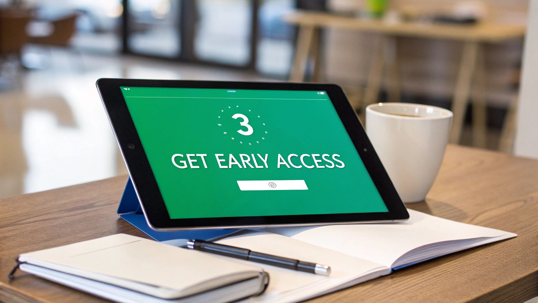
- "Get Early Access": This is a classic for a reason. It promises a real reward: shopping the deals before the masses descend.
- "Be the First to Know": This one taps directly into our desire for insider information and exclusivity. It works.
- "Unlock Black Friday Deals Now": Action-oriented language like this implies the deals are locked away, and an email address is the key. It's a powerful psychological trigger.
- "Join the VIP List": This language immediately elevates the subscriber's status, making them feel special and part of an exclusive club.
Placement is everything. The form and CTA must be directly below or next to the countdown timer. It needs to be a seamless visual connection. The user sees the urgency (the clock) and the solution (the sign-up form) in a single glance. No thinking required.
Building a Dedicated Countdown Landing Page
Want maximum focus? Build a dedicated landing page where the countdown and the lead capture form are the main event. Nothing else.
Strip away every other distraction. No complex navigation menus, no competing offers, no links to your "About Us" page. This page has one job and one job only: convince the visitor to sign up for your sale.
This approach is incredibly effective because it respects the user's intent. Someone who clicks an ad for "Black Friday Early Access" expects to see exactly that—not your entire product catalogue. A focused landing page honours that expectation and dramatically increases conversion rates.
A great countdown landing page tells a simple story: "Something amazing is coming soon. Here’s the clock to prove it. Give us your email, and you'll be at the front of the line when it arrives." It’s that clear and simple.
This is a core part of building an effective lead generation system. The countdown is the hook; the landing page is the tool that turns that interest into a measurable lead. We dive much deeper into this in our article on building a complete lead generation system.
Segmenting Your New Subscribers
Okay, so the emails are rolling in. Great. Now, whatever you do, don't just dump them into your main marketing list. That's a huge mistake.
These subscribers are special. They've explicitly raised their hands and told you they're interested in your Black Friday event. Treat them that way.
Create a specific segment or tag for them—something like "Black Friday VIPs" or "BFCM 2024 Waitlist." This simple step allows you to send targeted, relevant messages as the big day approaches. Think sneak peeks, behind-the-scenes content, or even a pre-sale offer just for them. This tailored communication keeps them warm and primed to buy.
The awareness around Black Friday is already sky-high. Even back in 2015, a survey showed that about 76% of people were aware of Black Friday, with a massive preference for online deals—a trend that's only exploded since. You can see more on its history on Germany in USA.
Your job is to make your offer strong enough to earn that sign-up. If you need help refining what you're offering, check out a tool like the free lead magnet audit from Magnethive at https://magnethive.io?ref=post. It generates a comprehensive report with 3 AI-powered lead magnet ideas, analysis of your current lead magnet, and shows ROI impact, helping you pull in the highest quality leads possible.
Optimising Your Countdown for Maximum Impact
Getting your countdown for Black Friday live is just the starting line. Now comes the real work: turning a good tool into a high-performance conversion engine. This is where we stop thinking "set it and forget it" and start squeezing every last drop of value out of your timer with smart tactics like personalisation and A/B testing.
A one-size-fits-all countdown is a massive missed opportunity. Your audience isn't a single entity; it's a mix of loyal fans, curious first-timers, and everyone in between. A proactive approach means your countdown isn't just ticking away—it's learning and evolving to get better every day.

This is about making your countdown adapt to who’s looking at it. It's about crafting a more relevant, more persuasive experience that meets the user exactly where they are in their journey with you.
Personalisation and Audience Segmentation
Imagine showing a completely different message to a loyal customer than you do to a first-time visitor. That’s the core of personalisation. By slicing your audience into segments, you can roll out different countdown experiences that speak directly to each group.
Here are a few ways to put this into practice:
- VIP Early Access for Loyal Customers: Dig into your customer data to flag repeat buyers. For them, show a unique countdown that ends 24 hours before the main event, with a headline like "Your VIP Access Starts In..." It’s a powerful way to reward loyalty and create some serious exclusivity.
- 'Last Chance' for New Visitors: For new or anonymous traffic, a standard countdown to the main sale works great. The messaging here can be broader, zeroing in on the universal appeal of your Black Friday deals.
- Geotargeted Timers: If you’re selling across different time zones, a timer that counts down to midnight in the user's local time feels way more personal and accurate than a generic one set to GMT.
This level of segmentation transforms a simple timer into a sophisticated marketing machine, making each user feel like they're getting an offer made just for them.
A Framework for A/B Testing
You should never assume you know what works best. A/B testing is how you trade guesswork for hard data, making small, iterative tweaks that can lead to huge performance gains. The secret is to test just one element at a time; that way, you can clearly attribute any lift (or drop) in performance to that specific change.
Your mission is to uncover the perfect cocktail of elements that drives the most sign-ups, clicks, or sales. We can build out a simple testing framework you can start using right away.
Don't just launch a countdown; challenge it. Every element—from the CTA button text to its on-page placement—is a hypothesis waiting to be tested. Data-driven decisions will always outperform assumptions, turning a good campaign into a great one.
Here’s a practical table of high-impact variables you can start testing today. For each experiment, you’ll need two versions of your page (A and B) and a tool to split your traffic between them.
A/B Testing Ideas for Your Black Friday Countdown
This table outlines a few simple but powerful tests. Pick one, run it, and let the data tell you what your audience really responds to.
| Element to Test | Variation A (Control) | Variation B (Test) | Primary Metric to Track |
|---|---|---|---|
| CTA Button Text | "Get Notified" | "Get VIP Early Access" | Email Sign-up Rate |
| Timer Placement | Hero Banner (Top of Page) | Sticky Footer Bar | Click-Through Rate (CTR) |
| Timer Design | Brand-Aligned Colours | High-Contrast Red & Orange | Conversion Rate on CTA |
| Headline Copy | "Our Black Friday Sale is Coming" | "Don't Miss Black Friday's Biggest Deals" | Page Engagement Time |
Once you find a winner, Variation B becomes your new control, and you can start testing another element. This constant cycle of improvement is what separates the pros from the amateurs.
Tracking the Right Metrics
Running tests without tracking the right data is like driving blind. The numbers you collect are what guide your next move and tell you which variation is the undisputed champ. While every campaign is different, a few key performance indicators (KPIs) are almost always essential for a countdown campaign.
Laser-focus on these three areas:
- Lead Generation Rate: What percentage of visitors who see your countdown actually sign up for the early access list? This is the most direct measure of your CTA’s effectiveness.
- Click-Through Rate (CTR): If your countdown is meant to drive people to a landing page, the CTR on the timer or its button is critical. It tells you how well you're grabbing attention and sparking action.
- On-Page Engagement: Look at metrics like time on page or scroll depth. A countdown that keeps people on the page longer is one that’s successfully building anticipation and holding their interest.
By constantly testing, measuring, and refining, you graduate from just having a countdown to running an optimised, high-impact campaign. This data-first approach is what separates the brands that just show up from the ones that truly own the Black Friday season.
Burning Questions Answered
Running your first Black Friday countdown can feel a bit daunting. A few specific questions always pop up, so let's tackle them head-on. My goal is to give you clear, practical answers so you can launch your campaign with total confidence.
What Should Happen When The Timer Hits Zero?
This is the moment of truth. When that timer hits 00:00:00, the experience needs to be instant. You've spent days, maybe weeks, building up hype, and now you have to deliver on it.
The worst thing you can do is leave a dead timer sitting on the page. I've seen it happen, and it's just confusing. It forces the user to figure out what to do next, which kills all the momentum you just built.
The best move? Automatically redirect users to your main sales page. An even slicker option is to dynamically reveal the deals right there on the current page. If that's too complex, a simple and effective alternative is to replace the finished timer with a big, bold button that screams "Shop The Sale Now!".
Can I Actually Put a Countdown in an Email?
Yes, you can, but it’s a bit of a workaround. Most email clients (like Gmail and Outlook) won't run the JavaScript needed for a live web timer. It’s a security thing.
The industry-standard solution is pretty clever: an animated GIF countdown.
You use a service that generates a GIF that looks and acts like a real-time countdown. You then embed this GIF into your email template just like any other image. Every time someone opens the email, their email client requests the image from the server, which serves up an updated version of the GIF. It creates a powerful sense of urgency that plain text just can't match.
Just make sure you link that GIF directly to your landing page to capture the click the second they feel that urgency.
How Long Should My Countdown Run For? Short or Long?
There’s no single "right" answer here. The perfect duration comes down to one thing: what's your main goal for this campaign?
- Go Long (7–14 days): This is your best bet for building anticipation and maximising lead generation. A longer window gives you plenty of time to promote the upcoming sale, get people to sign up for early access, and create a real buzz. Think of it as a pre-launch party.
- Go Short (24–72 hours): This is all about raw, last-minute urgency. It’s perfect for driving immediate sales. Use this for a flash sale, a final "last chance" push before the deals end, or to highlight specific "doorbuster" offers during the Black Friday weekend itself.
A lot of savvy brands actually use a hybrid approach to get the best of both worlds. They'll kick things off with a long timer for the pre-launch phase to collect leads, then switch to shorter, more aggressive timers for specific high-value offers during the main event.
Ultimately, you need to match the timer's length to the specific action you want your visitors to take. Once you get your head around these common questions, you can stop worrying about the mechanics and focus on what really matters: driving results.