Question with multiple choice: Boost Conversions with Perfect Prompt Design
Learn how to craft a question with multiple choice that guides leads, designs effective options, and uses scoring to boost conversions.

A good old question with multiple choice is one of the quickest ways to pull valuable, structured data from potential customers. Instead of making people type out long answers, you give them predefined options. This makes it ridiculously simple for them to share what they need and want with just a click.
Why Multiple Choice Is Your Lead Generation Secret Weapon

It's time to stop thinking about multiple-choice questions as just something for school tests. In the world of lead generation, they're a powerful way to turn a passive visitor into an engaged, qualified prospect. The biggest win? You massively cut down on user friction.
Think about a traditional lead form that asks, "What are your biggest marketing challenges?" That's an open-ended question that requires real mental effort. Honestly, most people will just give up and leave.
Now, flip that into a multiple-choice question. You present clear options like "Generating enough leads," "Improving conversion rates," or "Proving ROI." Suddenly, it's effortless for users to pinpoint their pain points. This doesn't just boost your completion rates; it gives you clean, structured data you can use immediately.
Capturing Data and Building Trust
This whole approach is the key to capturing zero-party data—the holy grail of marketing data that customers intentionally and proactively share. It’s a transparent value exchange: they give you insights, and you give them a personalised result, a recommendation, or a solution.
This first interaction immediately sets a consultative tone. Instead of a hard sell, you're guiding them towards a solution. You start building trust from the very first click. This is a core principle of modern interactive marketing, where genuine engagement is valued far more than just grabbing data.
Key Takeaway: A multiple-choice format shifts lead generation from a transactional data grab to a consultative dialogue. It lowers the barrier to entry, getting more prospects to engage while handing you perfectly segmented data on a silver platter.
Personalisation at Scale
The real magic of using a question with multiple choice happens after the click: immediate segmentation and personalisation. Each answer can be tied to a specific score, tag, or outcome.
This lets you:
- Qualify leads in real-time by spotting high-intent answers.
- Segment your audience into distinct buckets based on their needs.
- Deliver a tailored result or call-to-action that feels like it was made just for them.
This level of responsiveness is something static forms just can't compete with. Check out this table to see the difference starkly.
Interactive Questions vs Traditional Lead Forms
| Feature | Multiple Choice Questions | Traditional Lead Forms |
|---|---|---|
| User Experience | Engaging, fast, low-effort. Feels like a conversation. | Static, demanding, high-effort. Feels like filling out paperwork. |
| Completion Rate | Significantly higher due to reduced friction. | Often low; high abandonment rates. |
| Data Quality | Structured, clean, and immediately actionable. | Unstructured, messy, requires manual cleaning. |
| Personalisation | Allows for immediate, dynamic personalisation and segmentation. | Generic, one-size-fits-all approach. |
| Lead Qualification | Can be automated in real-time based on answers. | Manual or delayed qualification process. |
| Trust Building | Consultative approach builds trust from the start. | Transactional; can feel impersonal and intrusive. |
The data speaks for itself. Interactive questions create a better experience and deliver more valuable results.
For an even more advanced take, see how platforms are using AI-powered quizzes to dynamically analyse responses and generate high-quality leads. This is the kind of responsiveness that makes interactive tools a vastly superior choice for any modern marketer.
Framing Questions That Uncover Real Customer Needs
Let's get one thing straight: you're not just asking questions. You're strategically framing them to get the answers you need. The magic of a high-converting multiple-choice question isn't in the wording itself, but in the goal behind it.
Before you even think about writing, you have to ask yourself: what am I trying to achieve here? Are you segmenting leads for different email sequences? Qualifying prospects to see if they're a good fit? Or guiding a user to the perfect product recommendation?
This single decision shapes everything that comes next. A SaaS company might want to uncover a user's biggest operational headache. An agency, on the other hand, might need to figure out a prospect's marketing maturity level. When you work backwards from your end goal, every click becomes a meaningful step forward for both you and the user.
The Psychology of Question Framing
How you frame a question has a massive impact on the answer you get. Your goal is to guide people toward giving you useful information, but it can't feel like you're cornering them. It has to feel like a helpful conversation, not an interrogation.
A huge part of this is building momentum. We've all started a quiz and bailed after a few confusing questions. The best interactive tools start easy to build confidence. Publicly available quiz data often shows a drop-off pattern as question difficulty increases. A smart strategy is to maintain high engagement early on before introducing more qualifying questions.
For example, starting with questions that most people can answer confidently keeps them engaged. Then, as you introduce slightly more specific questions, you start to qualify their expertise without scaring them off. For B2B marketers, this is gold. You're effectively segmenting your audience into different buckets for personalised follow-ups, all based on a few simple clicks.
Creating a Logical and Engaging Flow
Nothing kills engagement faster than a random sequence of questions. People need to feel like they're on a coherent journey. Each question should flow naturally from the last, creating a narrative that makes them feel like you get them.
Here's a simple flow that just works:
- Start Broad: Kick things off with a high-level question to set the scene. Think something like, "What's your primary business goal right now?"
- Drill Down: Next, get more specific based on their first answer. For example, "Which of these challenges is getting in the way of that goal?"
- Qualify Intent: Finally, wrap up with a question that gauges where they are in their buying journey. Something like, "What's your timeline for solving this issue?" works perfectly.
Clarity is everything. You need to be crystal clear with what you're asking. It's a lot like learning how to create effective AI prompts for better results; the quality of the output depends entirely on the clarity of the input. Vague questions lead to useless data.
A well-framed question doesn't just collect an answer; it qualifies intent, segments the user, and personalises the next step in their journey, all in a single click.
If this is your first rodeo, our detailed guide on how to make an online quiz is the perfect place to start. Getting these fundamentals right is the key to building an interactive tool that actually moves the needle.
Crafting Answer Options That Deliver Actionable Insights
So you’ve nailed the question. That’s a great start, but you're only halfway there.
The answer options you offer are just as important—maybe even more so. They’re the pathways that guide people to the right solution. Bad options give you muddy, useless data. Good options give you crystal-clear segments you can actually act on.
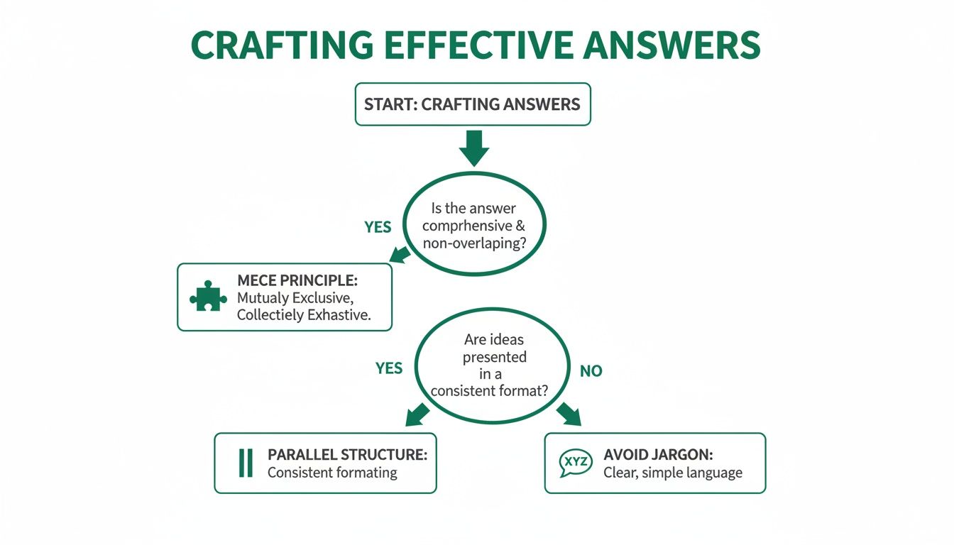
The secret to getting this right isn’t complicated. It’s a simple framework called the MECE principle: Mutually Exclusive, Collectively Exhaustive. Sounds a bit corporate, I know, but it works.
- Mutually Exclusive: Each option needs to be totally distinct. Someone should never feel like two answers could fit them. No overlap.
- Collectively Exhaustive: Your options should cover all the likely scenarios. No one should be left thinking, "Uh, none of these apply to me."
When you stick to this, you kill confusion and make sure every response is a clean data point. It’s the difference between guessing what your audience wants and knowing it.
Keep It Clean, Keep It Consistent
Alright, let's get practical. The way you word your options completely changes how people see them, which directly impacts the quality of the data you get back. A simple trick here is to keep a parallel structure.
If one answer starts with a verb, they should all start with a verb. This creates a natural rhythm, making the list super easy to scan and reducing that little bit of mental friction that causes people to drop off.
Let's say you're asking about a marketing challenge.
- Good: "Generating more leads," "Improving conversion rates," "Increasing brand awareness."
- Bad: "Lead generation," "To improve conversions," "Awareness of our brand."
See the difference? The first one flows. The second one is a jumbled mess. This small detail signals that you’ve actually thought about the user experience, and it builds subconscious trust.
And please, for the love of good data, drop the industry jargon. You might live and breathe your sector's acronyms, but your prospect doesn't. Use simple, direct language. Clear communication is the foundation of getting accurate insights.
Key Insight: Your goal isn't to sound smart. It's to make the user's choice effortless. Clarity beats cleverness every single time when it comes to getting data you can trust.
How Many Options Is the Right Number?
So, what's the magic number of choices? The honest answer is there isn't one, but there's a definite sweet spot. You're trying to find the balance between getting enough detail for proper segmentation and not giving your user analysis paralysis.
Most of the time, three to five options is perfect.
This range gives you enough variety to see the nuances in your audience without overwhelming them. Any fewer than three can feel restrictive, but more than five often introduces tiny differences that are hard for people to choose between (and even harder for you to act on later).
But what if none of the options fit? That's where "None of the above" or "Other" comes in handy. It’s your safety net, making sure you stick to the "Collectively Exhaustive" part of the MECE principle. It stops people from either bouncing or, worse, picking a random, inaccurate answer out of frustration—which keeps your data clean.
Ultimately, every single option should map directly to a segment you want to create or a personalised result you want to deliver. Think of each choice as a fork in the road, helping you understand a prospect's real problems, budget, and readiness to buy.
100% Free Lead Magnet Audit
Our AI analyzes your website and delivers custom growth strategies in seconds.
How to Implement Smart Scoring and Segmentation Logic
Once you’ve nailed your questions and answers, the real magic happens behind the scenes. This is where your simple quiz morphs into a dynamic lead-gen engine. By assigning scores to answers and building out segmentation rules, you can turn user input into genuine business intelligence.
It’s not just about getting a response; it’s about decoding the intent behind it. Different scoring models let you do this, and you can start simple. A basic point system where each answer has a set value works just fine, or you can get more advanced with weighted scoring to give more importance to answers that scream "high-value lead."
For example, a prospect who selects "We have a budget of over $10,000 and are ready to start this quarter" is obviously a hotter lead than someone who's just doing initial research. That first answer should carry a much heavier score. This is the bedrock of a smart lead qualification system.
This flowchart breaks down how to craft effective answers—a critical first step before you can even think about scoring.

The key takeaway here is that clear, well-structured answers are the foundation of any reliable scoring system. Without them, your segmentation logic is built on sand.
Building Your Segmentation Buckets
With a scoring system locked in, you can start mapping combinations of answers to specific outcomes. This is where you bucket leads into predefined categories based on their total score or specific answer patterns. This is where your marketing automation truly comes to life.
Here are a few common segmentation buckets that work well:
- Sales-Ready: These are your high scorers. They've indicated budget, authority, and an immediate need. Route these leads straight to your sales team for a prompt follow-up. Don't let them go cold.
- Nurture: These are the mid-range scorers. They're interested but might not be ready to buy just yet. These leads are perfect for a targeted email sequence that offers more value and educational content.
- Low-Fit: Your low scorers. They're unlikely to become customers, and that's okay. You can add them to a general newsletter list, but they shouldn't be taking up your sales team's valuable time.
This kind of automated routing massively improves pipeline efficiency. If you want to dive into the technical side, our guide to lead scoring in HubSpot walks through the practical implementation steps.
Using Confidence to Qualify Intent
Here’s an interesting tactic: use "easy win" questions to build a user's confidence before qualifying them on deeper knowledge. For example, a quiz for marketers could start with a question like, "Which of these is a social media platform?" with obvious answers. A high accuracy rate on foundational topics can act as a trigger, funnelling knowledgeable users toward more advanced content or offers.
This approach is brilliant for capturing zero-party data and sending high-scorers to tailored recommendations. You can explore public data on user quiz performance to see these patterns in action for yourself, even if the topics differ from your own.
Pro Tip: Don't just score individual answers. Create rules that look at combinations of responses. A user who has a large budget and a short timeline is a far more qualified lead than someone who only checks one of those boxes.
By connecting specific answers to clear outcomes, you create a self-qualifying funnel that delivers the right experience to every single user. This is precisely how the most effective lead magnets work. An automated tool like the free Magnethive lead magnet audit analyses user inputs to generate a comprehensive report with customised ideas, showing this principle in action. Your interactive tool should do the same: deliver immediate, personalised value based on the data it collects.
Designing for an Engaging and Accessible User Experience

You can have the most brilliant question logic in the world, but it won’t matter one bit if the user experience is clunky or confusing. A great design isn't just about looking good; it's about getting people from that first click all the way to their final result without a single moment of frustration.
This is where visual elements become your best friend. Something as simple as a progress bar manages a user's expectations and gives them a small sense of accomplishment with each answer. That little visual cue alone can be the difference between someone finishing your quiz or bailing halfway through.
Pair that with clean typography and a mobile-first layout, and you've got a frictionless experience that keeps people locked in.
The Psychology of Engagement
Beyond the visuals, there are subtle psychological cues that can make a massive difference. Your tone matters. Frame your questions like a helpful conversation, not a sterile interrogation. You’re guiding someone to a solution, not just extracting data from them.
Small details like micro-interactions—a subtle button animation or a positive checkmark after an answer—provide immediate positive feedback. It makes the whole thing feel more responsive and human, which subconsciously builds trust and keeps the momentum going. Your goal is to make it feel less like a form and more like a guided chat with an expert.
Another effective tactic is to balance the difficulty of your questions. Start with easier ones to build confidence and hook the user. Later on, you can introduce more challenging questions that help you segment their intent more accurately. This strategy alone can significantly boost completion rates.
Quiz data backs this up. For instance, a quiz on world capitals might show high accuracy for well-known cities but lower scores for more obscure ones. You can dive deeper into these quiz statistics and user patterns to see just how powerful this kind of question structuring can be, regardless of the specific subject matter.
Making Your Quiz Accessible to Everyone
Let's make one thing clear: accessibility isn't an optional extra. It's a fundamental part of good design.
When you ensure your quiz is usable by everyone, including people with disabilities, you’re not just being inclusive—you’re expanding your potential audience. Following the Web Content Accessibility Guidelines (WCAG) is the gold standard here, and it's easier to implement than you might think.
Here's a quick checklist to run through to make sure you're covering the most important bases for both user experience and accessibility.
UX and Accessibility Checklist for Interactive Quizzes
| Checklist Item | Why It Matters | Implementation Tip |
|---|---|---|
| High Colour Contrast | Ensures text is readable for users with visual impairments like colour blindness. | Use a tool like Adobe Color's contrast checker to verify your text and background combinations meet WCAG AA standards. |
| Large, Tappable Buttons | Prevents frustrating mis-clicks, especially on mobile devices. | Make sure your buttons and clickable areas have a minimum target size of 44x44 CSS pixels. |
| Full Keyboard Navigation | Crucial for users who cannot use a mouse due to motor disabilities. | Tab through your entire quiz. Can you reach and select every single answer and button? If not, fix the focus order. |
| Clear, Descriptive Labels | Allows screen reader software to correctly interpret the interface for blind or low-vision users. | Use ARIA labels if necessary, but standard HTML <label> tags for form elements are often all you need. |
| Progress Indicators | Manages user expectations and reduces anxiety about the length of the quiz. | A simple "Question 3 of 8" text or a visual progress bar works perfectly. |
| Mobile-First Design | The majority of users will likely be on their phones. A clunky mobile experience is a conversion killer. | Design for the smallest screen first, then scale up. Test on actual devices, not just browser emulators. |
Putting in this effort up front pays off massively. By thinking about these details, you're not just ticking a box; you're building a better, more effective tool that works for everyone.
An accessible design is an effective design. By removing barriers, you not only comply with standards but also create a superior experience for every single user, ultimately leading to better engagement and higher-quality leads.
Got Questions? I’ve Got Answers.
When you're deep in the weeds of building an interactive tool, a few common questions always seem to pop up. Let's tackle them head-on so you can get back to building something that actually converts.
How Many Questions Should My Quiz Actually Have?
There's no magic number, but it really boils down to your goal. Are you trying to grab attention at the top of the funnel? Keep it short and punchy. Five to seven questions is the sweet spot for broad engagement, giving just enough value without making people bail.
But if you're qualifying leads or doing a proper assessment, you'll need more runway. Think somewhere between 10 and 15 questions. The golden rule is that every single question must earn its place by feeding directly into your scoring and segmentation. If it doesn't, cut it.
Here's a pro tip: aim for a total completion time of under two minutes. Even better, tell people upfront. A simple header like "Take our 2-minute marketing health check" manages expectations and gives your completion rates a nice little boost.
What’s the Right Way to A/B Test My Questions?
Slow down. The biggest mistake people make is testing too many things at once. To get clean, useful data, you have to isolate your variables. Change just one thing at a time.
Start with the heavy hitters—the elements with the most impact. Your quiz headline and the very first question are perfect candidates because they determine if someone even starts.
Once you've got that dialled in, you can move on to other experiments:
- Question Phrasing: Try different angles. Is "What's your biggest business challenge?" better than "Which of these challenges keeps you up at night?" You won't know until you test.
- Answer Options: Play around with the number of choices or tweak the wording. Sometimes a small change in language makes a huge difference in clarity.
- The Final CTA: Don't forget the call-to-action. Test different offers or button copy after you deliver the results to see what actually drives a conversion.
Keep a close eye on your completion rates, where people are dropping off, and the final conversion numbers for each version. The data will tell you who the winner is.
Should I Bother with Images or Icons in the Answers?
Yes, absolutely. Don't underestimate the power of visuals. They can make your quiz feel less like a test and more like a fun, engaging experience. Icons or images break up the text, make choices easier to scan, and can seriously lift engagement.
Imagine a marketing agency quiz. Instead of just text, you could use simple, clean icons for social media, SEO, or email marketing. It’s instantly more appealing.
Just make sure any visuals you use are high-quality, load lightning-fast (especially on mobile), and—this is critical—have descriptive alt text. Accessibility isn't optional; screen readers need that text to describe the image to visually impaired users.
What if None of the Options Fit My User?
Ah, the classic dead-end problem. The fix is surprisingly simple: always include an escape hatch. A well-placed "Other" or "None of the above" option is your best friend here.
It stops users from getting frustrated and abandoning your quiz. Worse, it prevents them from just picking a random, inaccurate answer that messes up your segmentation data.
For those critical questions where you need the details, you can even connect that "Other" option to a conditional text field. It only appears if they select it, allowing them to type in a custom response. Just use this feature sparingly. It adds a bit of friction, but the qualitative insights you can get from it are often pure gold.