Build a High-Value Website Audit Tool
Learn how to build a website audit tool that drives demand. This guide covers design, development, and promotion for a powerful lead generation asset.

A website audit tool is, at its core, a piece of software that analyses a site's performance—think SEO, user experience, and technical health. But a truly great website audit tool is much more than a simple checklist. It delivers personalised, actionable insights that show a user exactly what's holding their site back.
The Power of an Interactive Website Audit Tool
I remember the exact moment I lost faith in the traditional lead magnet. I had just downloaded my tenth "Ultimate Guide to SEO" PDF. It was another static document promising secrets but delivering the same generic advice I’d already seen a hundred times. It just sat in my downloads folder, unread, creating digital clutter.
That’s the problem you're likely facing—your audience is drowning in content but starving for real answers.
This frustration sparked a realisation: what if, instead of just telling potential customers how to fix their problems, we could actually show them, instantly? This is the massive difference between a static PDF and a dynamic, interactive website audit tool. One is a monologue; the other is a conversation. Even a simple, focused tool can become a traffic and lead generation machine.
From Passive Content to Active Engagement
A static lead magnet, like an ebook or a whitepaper, is a "one-size-fits-all" solution. It assumes every single reader has the same challenges, goals, and level of understanding. This approach creates a huge gap between the content you provide and the specific, pressing problem your user is trying to solve right now.
An interactive tool completely flips the script.
It provides immediate, personalised value by analysing the user's actual website and spitting out a custom report. This isn't about generic, AI-generated fluff; it's about building a simple machine that demonstrates your expertise on the spot. By offering a real solution upfront, you build trust and showcase your capabilities far more effectively than any downloadable guide ever could. If you want to dig deeper, our guide on adding interactivity to websites has some great insights.
This flowchart shows the shift from passive info-dumping to active, value-driven lead generation.
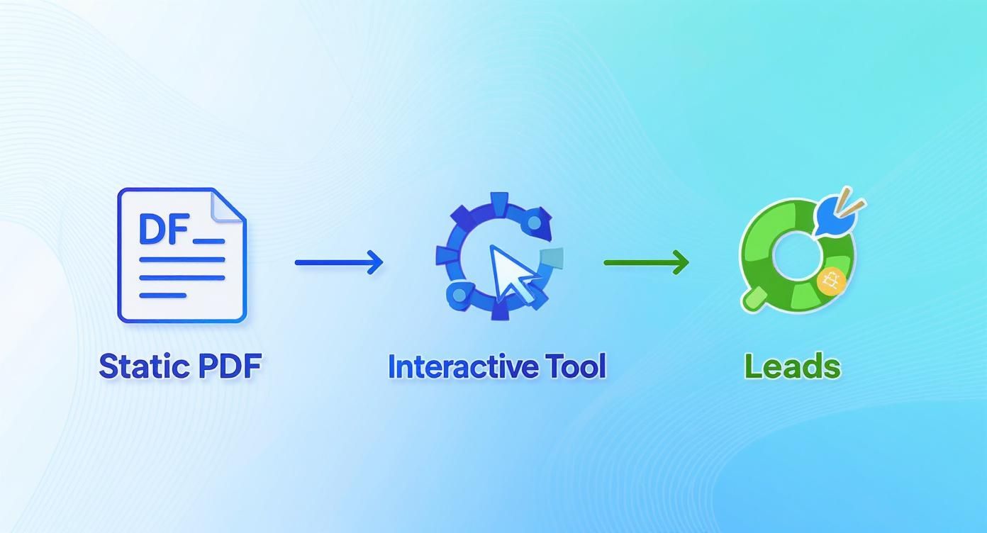
This process is a bridge. It transforms a user's initial problem into a qualified, engaged lead simply by delivering immediate, relevant value.
Building Trust Through Instant Value
Most marketing funnels are built backwards. They demand an email address before providing any real, tangible value. This just creates friction and scepticism. Why should someone trust you with their inbox when you haven't even proven you can help them?
The most powerful marketing doesn't feel like marketing at all. It feels like help. An interactive website audit tool is the ultimate form of help—it diagnoses a problem and offers a solution, all within a few seconds.
To really get the full picture of what these tools can do, it's worth checking out The Ultimate Guide to Conducting a Website Audit. It covers all the essential steps and considerations.
This guide you're reading now isn't just theory, though. It’s a practical blueprint for building your own tool, taking you from a rough idea to a tangible asset that generates high-quality demand for your business.
Defining Your Audit Criteria and Scoring System
The soul of a killer website audit tool isn't a hundred-point technical checklist. It's a scalpel, not a sledgehammer. The real magic happens when you deliver a focused diagnosis that hits the most painful problems your ideal customer is facing right now.
Forget trying to audit everything under the sun. You’ll just spit out a noisy, overwhelming report that gets ignored. Instead, become completely obsessed with your customer. What keeps them tossing and turning at night? Are they bleeding money from low conversion rates on their landing pages? Are they terrified their content isn't ranking or actually connecting with their audience?
Your audit criteria need to be a direct mirror of these core pain points. This focus is what elevates your tool from just another generic checker into an indispensable diagnostic they can't live without.
Selecting Your Core Audit Categories
To build a genuinely useful assessment, you need to look at a website holistically, but through the specific lens of your customer's problems. I've found it’s best to organise your audit around three key pillars that cover the most common business headaches.
- User Experience (UX) and Usability: This is all about first impressions and how easy the site is to use. A clunky, frustrating experience is probably the number one reason visitors bounce. Your checks here should cover things like mobile responsiveness, navigation clarity, and page load speed.
- Conversion Optimisation: This is where you get down to business and analyse how well the site turns visitors into leads or customers. Look at the clarity of calls-to-action (CTAs), how easy it is to find and fill out contact forms, and the presence of trust signals like testimonials or client logos.
- Content and SEO Effectiveness: This category digs into how well the website's content attracts and persuades the right people. You can evaluate on-page SEO basics like title tags, whether they have a blog, and the readability of their key service pages.
You can even get more advanced than the usual checks. For instance, incorporating techniques like visual regression testing with screenshot APIs can automatically flag unintended UI changes over time—a powerful, specific check that most tools don't offer.
Building a Weighted Scoring System
A simple pass/fail for each checkpoint just doesn't cut it. Not all issues are created equal. A homepage that takes ten seconds to load is a five-alarm fire; a single missing alt tag is a minor nuisance. This is where a weighted scoring system becomes your secret weapon.
Assign an "importance weight" to every single checkpoint, maybe on a simple scale of 1 to 5.
A critical error, like a non-functional checkout button (Weight: 5), should tank the final score far more than a minor issue, like inconsistent font usage (Weight: 1). This forces the final score to accurately reflect the true health of the site and guides the user to what’s actually broken.
This approach gives your users a clear, at-a-glance picture of their website's performance and, more importantly, shoves them in the direction of fixing what matters most first. This is a foundational concept if you want to build genuinely useful SEO audit report tools that actually drive action.
Here’s a simple framework to give you an idea of how to structure this logic.
Sample Audit Criteria and Weighting Framework
A template for structuring your audit's scoring logic, balancing technical factors with user-centric metrics to provide a holistic assessment.
| Audit Category | Specific Checkpoint | Importance Weight (1-5) | Example 'Fail' Recommendation |
|---|---|---|---|
| User Experience | Website loads in under 3 seconds on mobile. | 5 | "Your mobile page speed is slow, which can cause visitors to leave. Optimise images and scripts." |
| Conversion | A clear Call-to-Action (CTA) is above the fold. | 4 | "Your primary CTA is not immediately visible. Move it higher to improve lead capture." |
| Content & SEO | Key service pages have unique, descriptive titles. | 3 | "Service page titles are generic. Customise them to improve search rankings and click-throughs." |
| User Experience | The main navigation menu is simple and intuitive. | 4 | "Your navigation has too many options. Consolidate items to help users find information faster." |
| Conversion | Trust signals (reviews, logos) are present. | 3 | "Adding customer testimonials can increase trust and improve conversion rates significantly." |
The massive growth in this space proves just how hungry businesses are for these kinds of targeted diagnostics. This demand is fuelled by businesses desperate for clear, actionable insights to get better results.
Ultimately, your goal is to build a scoring system that is not just accurate but also educational. It needs to translate complex technical jargon into a simple, meaningful score paired with crystal-clear next steps. That’s how your website audit tool becomes an indispensable resource people come back to again and again.
Choosing Your Tech Stack and User Experience
You could design the most brilliant, insightful website audit tool on the planet. But if using it feels like solving a Rubik's cube in the dark, nobody will stick around to see their results. A powerful diagnostic engine means absolutely nothing if the user experience (UX) is clunky or confusing.
This is where so many great ideas completely fall apart—not in the logic, but in the execution of the interface. A staggering 88% of users are less likely to return to a website after a bad experience. Your tool is a direct reflection of your brand's competence; a confusing UX hints that your solutions might be just as messy.

The goal here is to design a seamless journey. One that guides users effortlessly from their first click to their final, personalised report. This means thinking less like a developer and more like a first-time user who’s short on time and even shorter on patience.
Designing a Frictionless Frontend
The best interfaces just get out of the user's way. They make the whole process feel intuitive, fast, and maybe even a little bit rewarding. You don't need some complicated, animated masterpiece; you need clarity and momentum.
Here are a few UX patterns that work exceptionally well for audit tools:
- Multi-Step Forms: Ditch the massive wall of questions. Break the audit down into small, digestible chunks. Asking for one piece of information at a time (e.g., "What's your website URL?" then "What's your primary goal?") dramatically reduces cognitive load and makes the whole thing feel less intimidating.
- Progress Indicators: A simple progress bar or "Step 2 of 5" indicator is a powerful psychological tool. It shows users the finish line, manages their expectations, and gives them a reason to complete the process.
- Interactive Results: Don't just dump a score on the screen. Use simple charts, gauges, or colour-coded cards to visualise the results. This makes complex data instantly understandable and far more engaging than a plain old percentage.
A great user experience is like a good conversation. It flows naturally, asks one thing at a time, and provides clear feedback, making the user feel understood and guided rather than interrogated.
Building these flowing, intuitive interfaces is a craft. If you're starting from scratch and want to get the fundamentals down, there's a lot of value in learning the basics of how to code an online quiz in HTML, as many of the same UX principles apply.
Picking the Right Tech Stack for Your MVP
With your user experience mapped out, the next big question is: how are you actually going to build this thing? The tech stack you choose can be the difference between launching in a week and getting stuck in development hell for six months.
My advice is always the same: start with a Minimum Viable Product (MVP). Your first version doesn't need to be a technical marvel. It just needs to solve the core problem for your user and prove your idea has legs.
Here’s how to think about your options, from the fastest and cheapest to the most powerful and customisable.
No-Code and Low-Code Platforms
This is the fastest path from idea to reality, period. Especially if you're not a developer. Platforms like Outgrow, Jotform, or Typeform let you build surprisingly complex, logic-based quizzes and assessments with a drag-and-drop interface.
- Pros: Extremely fast to build and launch, zero coding skills required, and very budget-friendly. Perfect for building and testing an MVP.
- Cons: Limited in terms of custom design and API integrations. You might hit a ceiling if your audit logic becomes seriously complex.
Custom Development
This path offers unlimited flexibility but requires a serious investment of time, skill, and money. You’ll be building your website audit tool from the ground up, likely using a combination of frontend tech (like React or Vue.js) and a backend language (like Node.js or Python).
- Pros: Complete control over every single aspect of the UX, design, and functionality. You can integrate with any API and build highly specialised diagnostic logic.
- Cons: Much slower development time, significantly higher cost (whether hiring devs or using your own time), and requires ongoing maintenance.
The honest truth is that most people over-engineer their first tool. They spend months building a custom solution for a problem they haven't even validated yet. Start with a no-code platform to prove people actually want what you're offering. You can always migrate to a custom build later once you have real user data and revenue to justify the investment.
Your first goal isn't to build the perfect tool; it's to build a tool that gets used.
100% Free Lead Magnet Audit
Our AI analyzes your website and delivers custom growth strategies in seconds.
Getting Leads and Getting it Used
You’ve built an amazing diagnostic machine. Fantastic. Now for the hard part: turning all that clever code into actual business. This is the moment where your website audit tool either becomes a lead-gen engine or just another forgotten page on your site.
First up is lead capture, and this is where I see so many people mess up. They get greedy. They put up a hard gate, demanding an email before they’ll show a single result.
That’s a conversion killer.

Hard-gating your tool's results is a massive mistake. It creates friction and scepticism right away. You're asking a user for their most valuable digital asset—access to their inbox—before you’ve proven you can deliver a thing. It’s an interaction built on demand, not trust.
The Value-First Lead Capture Model
A much smarter play? Instant gratification. Show the user a summary of their results immediately, right there on the screen, no strings attached. This one simple act of generosity changes the entire dynamic.
You’ve just given them a tangible, personalised insight. You’ve helped them. Now they trust you. Only after you’ve delivered that initial value do you ask for more.
This is the two-step process that just plain works:
- Instant Summary: Display the overall score and the top 2-3 most critical findings directly on the results page. Think simple visuals like gauges or colour-coded cards that make the diagnosis easy to understand in seconds.
- Gated Deep Dive: Below that summary, offer a more comprehensive, detailed report via email. You have to frame this as an upgrade—a full PDF with expanded recommendations, step-by-step fixes, and bonus resources.
This model respects the user's time and intelligence. They get something useful immediately, which makes them far more likely to trade their email for an even deeper analysis. For a real-world example of this in action, our free lead magnet audit tool from Magnethive generates a comprehensive report with AI-powered ideas and an ROI analysis, showing its value before asking for anything.
By giving away the core diagnosis for free, you're not losing a lead; you're earning the right to ask for one. A value-first offer will always crush a hard gate because it’s built on reciprocity, not just a transaction.
Actually Getting People to Use Your Tool
Your new audit tool won't promote itself. You need to weave it into the fabric of your marketing and sales. Hiding it on some forgotten landing page is a recipe for failure.
You need to make it the star of the show.
Here are a few dead-simple ways to drive adoption:
- Homepage Call-to-Action (CTA): Ditch your generic "Contact Us" button. Replace it with a CTA that leads directly to the tool. Something like "Get Your Free Website Score" is way more compelling because it offers a clear, immediate benefit.
- In-Content Promotion: Embed the tool or link to it within your blog posts. Got an article on improving page speed? End it with a direct callout to use your tool to check their own site's performance. It’s a no-brainer.
- Sales Enablement: Give your sales team the tool to use during conversations. They can run a quick audit for a prospect live on a call, providing instant value and framing the conversation around that prospect’s specific pain points. It's an incredible icebreaker.
- Email Signature: Add a simple link to your tool in your company's email signatures. It's a low-effort way to get hundreds, maybe even thousands, of extra impressions every single week.
The goal is to make your website audit tool the most logical first step for anyone who has the problem your business solves. When you do that, you create a self-sustaining loop of value and leads that works for you 24/7.
Measuring Success and Optimizing for Growth
Launching your tool is the starting line, not the finish. I’ve seen so many people pour their hearts into building something brilliant, only to let it gather digital dust after the launch party. The real growth—the kind that turns a neat project into a predictable lead engine—comes from relentless, data-driven iteration.
If you aren't measuring, you're just guessing.
You need to get obsessed with the numbers that tell you the real story of how users are interacting with your creation. This goes way beyond a simple "total users" count, which is mostly a vanity metric.
You need to know the critical conversion rate: what percentage of people who start the audit actually finish it and become a lead? This single number tells you more about your tool's health than anything else.
Identifying Your Key Performance Indicators
To really get what's going on, you need to track a handful of core metrics. These KPIs will become your North Star, guiding every decision you make. Don't overcomplicate it; just focus on the data that directly connects tool usage to actual business results.
Here are the essentials you should be watching:
- Completion Rate: The percentage of users who start the audit and actually make it to the results page. A low rate here almost always signals friction in your questions or a clunky user experience.
- Lead Conversion Rate: Of those who finish, how many give you their email for the full report? This tells you how compelling your offer is after you’ve delivered the initial diagnosis.
- Drop-off Points: At which specific question or step do most users bail? Analytics tools can pinpoint the exact moment people get stuck, showing you exactly where to focus your fixes.
- Lead Quality: Are the leads coming from the tool a good fit? Track how many of them eventually turn into sales-qualified opportunities or, even better, paying customers.
A high completion rate paired with a low lead conversion rate is a classic sign that your initial results are valuable, but your offer for the detailed report isn't compelling enough. This is a fixable problem, but only if you can see it in the data.
Practical A/B Testing for Continuous Improvement
Once you have your baseline numbers, it's time to start experimenting. A/B testing isn't just for landing pages; it's an incredibly powerful way to fine-tune your audit tool. The goal is to make small, iterative changes and let the data tell you what works.
You don't need a massive development team for this. Even simple tweaks can produce a big lift.
Actionable A/B Testing Ideas:
- Test Your Call-to-Action (CTA): Experiment with the button text on your results page. Does "Download Your Full Report" convert better than "Get Your Personalised Action Plan"? The language you use to frame the value of the next step is critical.
- Vary the Number of Questions: Is your audit too long? Try a shorter version with only the most critical questions. See if the completion rate improves without tanking your lead quality. Sometimes less is truly more.
- Redesign the Results Page: The layout of your results matters. A lot. Test a version with a big, visual score (like a speedometer) against one that leads with the top three "quick wins." This helps you understand what users find most engaging.
The market for this kind of software is consistently growing. This is largely driven by better data visualisation and reporting. People want interactive dashboards and clear reports that help them understand and act on the findings—which is exactly what your A/B tests should be aiming to improve. You can discover more insights about audit software market trends on Research and Markets.
Ultimately, your website audit tool should never be "finished." Treat it like a living product that evolves based on real user behaviour. By constantly measuring, testing, and optimising, you ensure it remains a sharp, effective asset that consistently delivers high-quality leads. This iterative approach is what separates a one-hit-wonder from a long-term growth machine.
Got Questions About Your Website Audit Tool?
Building your first interactive tool can feel a bit daunting. A lot of "what ifs" can pop up and stop you dead in your tracks. I've been there. Let's walk through the most common questions and roadblocks I see people hit, so you can build yours with confidence.
How Technical Do I Need to Be to Build This?
Honestly? You don't need to be a developer at all to get a powerful tool off the ground.
You can build a killer Minimum Viable Product (MVP) with no-code platforms. Tools like Outgrow or even a souped-up Jotform are fantastic for creating really smart assessments using conditional logic. This lets you build a self-assessment tool to prove your concept without touching a single line of code.
The moment you need to pull live data from a user's website—say, through an API—that's when a developer usually steps in. But starting with a logic-based tool first is a brilliant way to test the waters and see if your idea has legs.
What's the Most Common Mistake People Make?
Trying to do way too much. It's the single biggest killer of these projects.
I see it constantly. Someone gets a great idea and decides to build a tool that audits 100 different things, from the most obscure technical SEO point to the colour of the footer. What you end up with is a massive, overwhelming report that just paralyses the user. They don't know where to start, so they do nothing.
The best tools aren't encyclopaedias; they're scalpels. They are hyper-focused on solving one painful, high-value problem for a very specific type of person.
Forget about boiling the ocean. Instead, zero in on the top 5-10 questions that keep your ideal customer up at night. Build your entire tool around giving them crystal-clear, actionable answers to just those questions. Focus beats breadth. Every. Single. Time.
How Do I Balance Giving Value with Getting Leads?
My rule here is simple and I never break it: value first, always.
The strategy that works wonders is to give the core results or a high-level summary right there on the screen, no email required. This isn't just being nice; it's a strategic move. It builds instant trust and immediately shows them you know what you're talking about.
After you've delivered that initial "aha!" moment, then you've earned the right to ask for their details. Offer something more—a detailed, downloadable PDF with step-by-step recommendations or a personalised action plan—in exchange for their email. This two-step dance respects your visitor and converts way better than a hard email gate ever will.
Should I Make the Tool Free or Paid?
For demand generation, this is a no-brainer: it must be free.
The whole point of an audit tool in this context is to be a powerful magnet at the top of your funnel. You're building it to attract your ideal customers at scale, prove your expertise, and start a conversation that could lead to a sale.
Slapping a price tag on it changes everything. It's no longer a marketing asset; it's a product. That price creates a massive barrier and kills your momentum. Giving it away for free is what unlocks its power to generate a steady stream of qualified leads for your actual services.